Microsoft Yammer | Craftsmanship
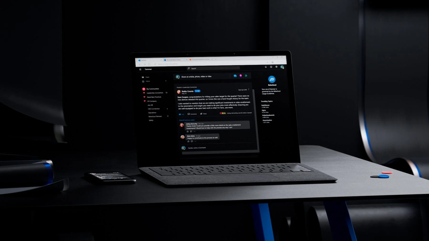
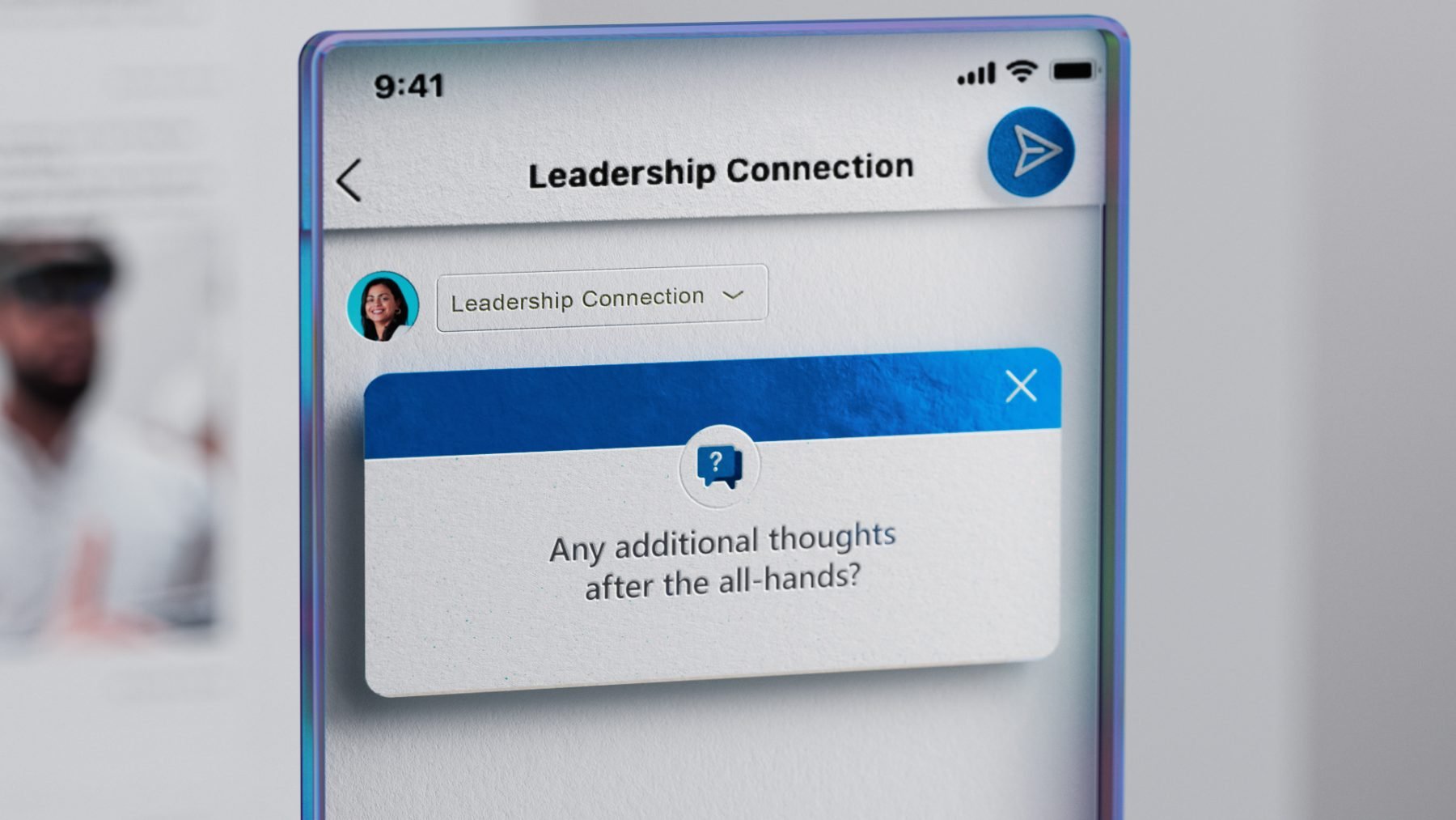
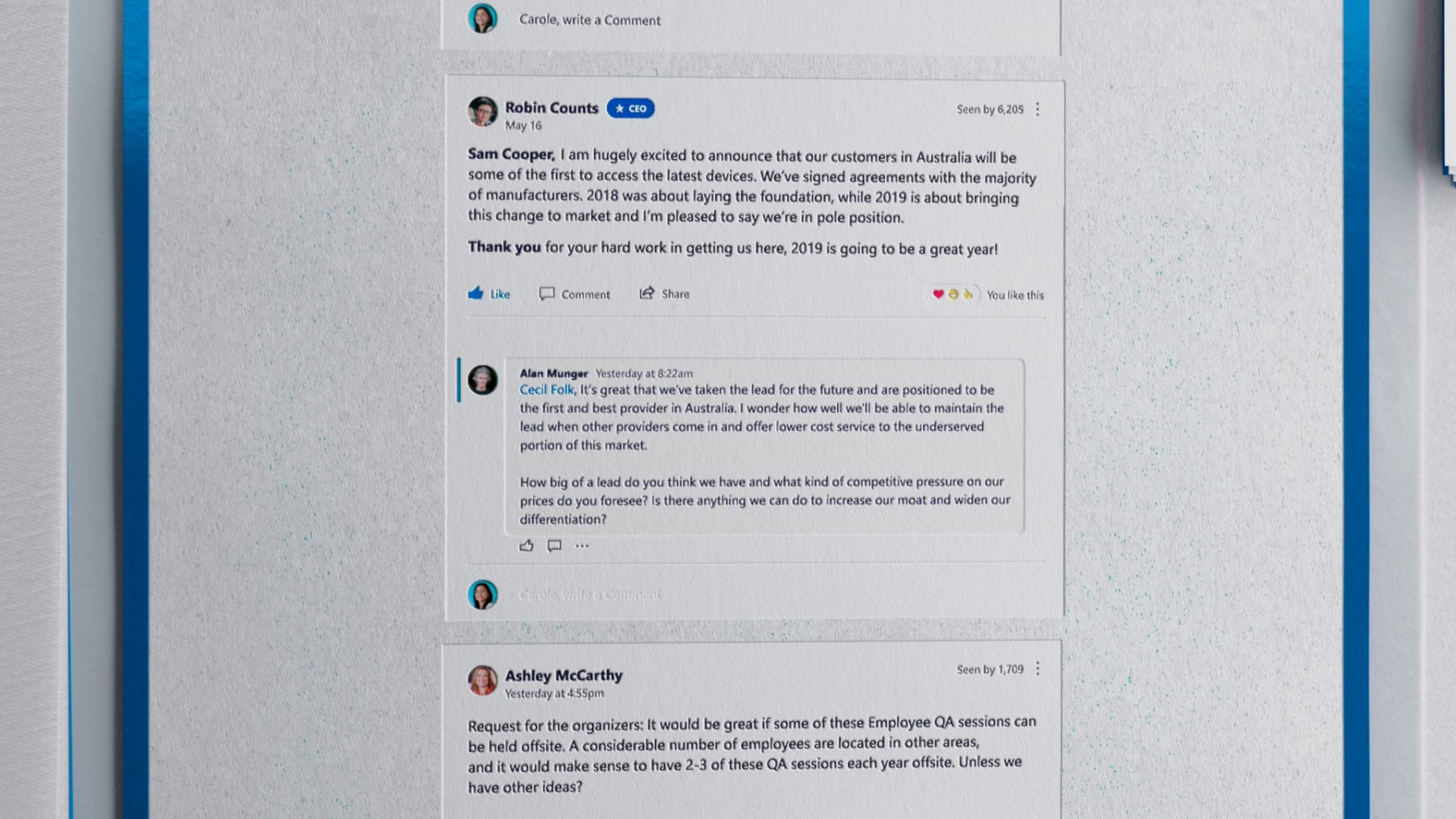
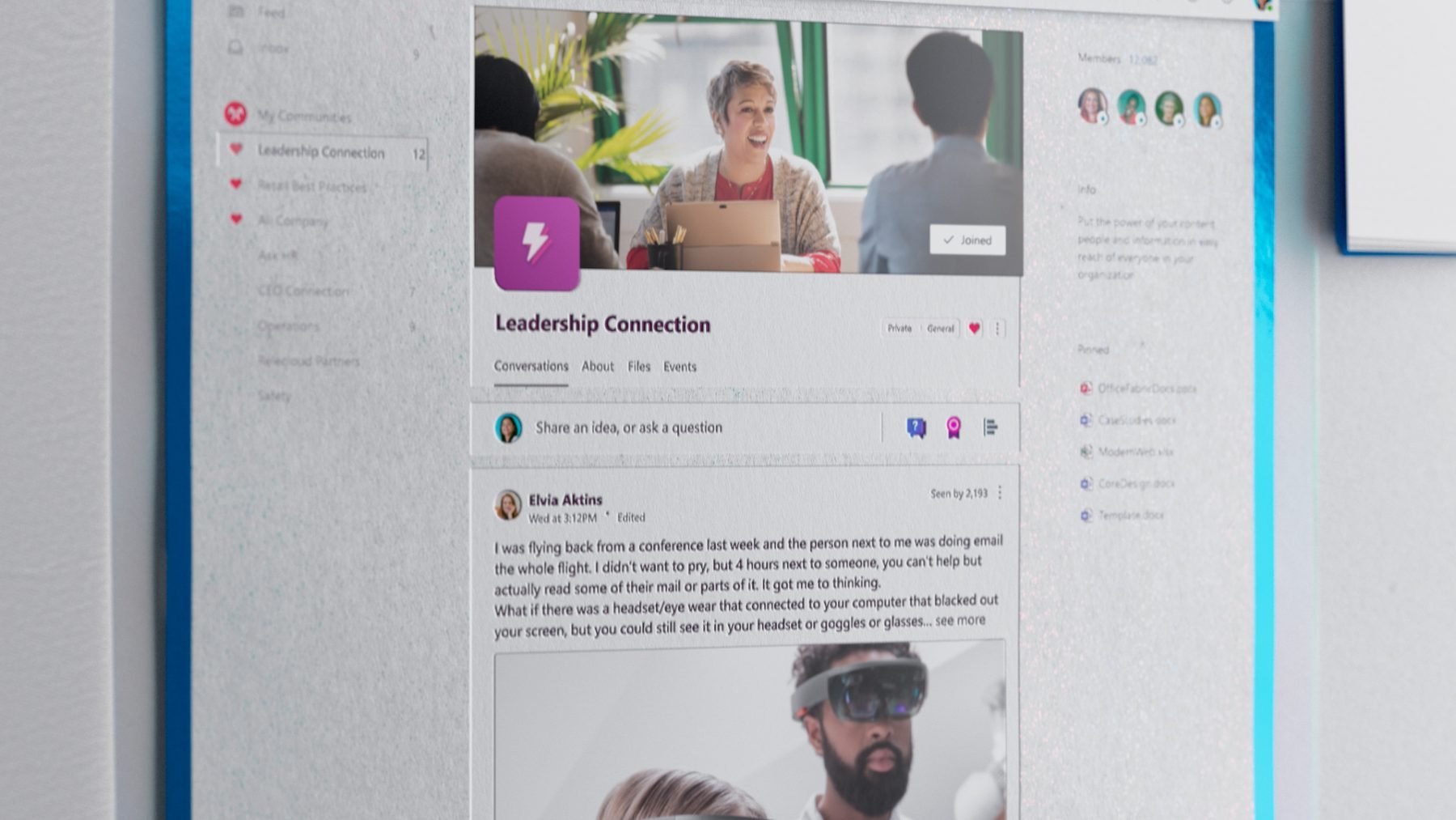
The film is meant to showcase how Yammer’s redesign leverages the Fluent Design System. The team at Microsoft established design guidelines in a purposeful use of typography, colour and motion to convey a delightful and highly functional app.
The goal was to create a film that displays how Yammer facilitates community, interaction and connectivity between people and organization. Our main creative challenge was bringing a warm, fluid and tactile feel to the UI elements while simultaneously conveying a sense of individual human experience throughout the interactions, materials and storytelling.
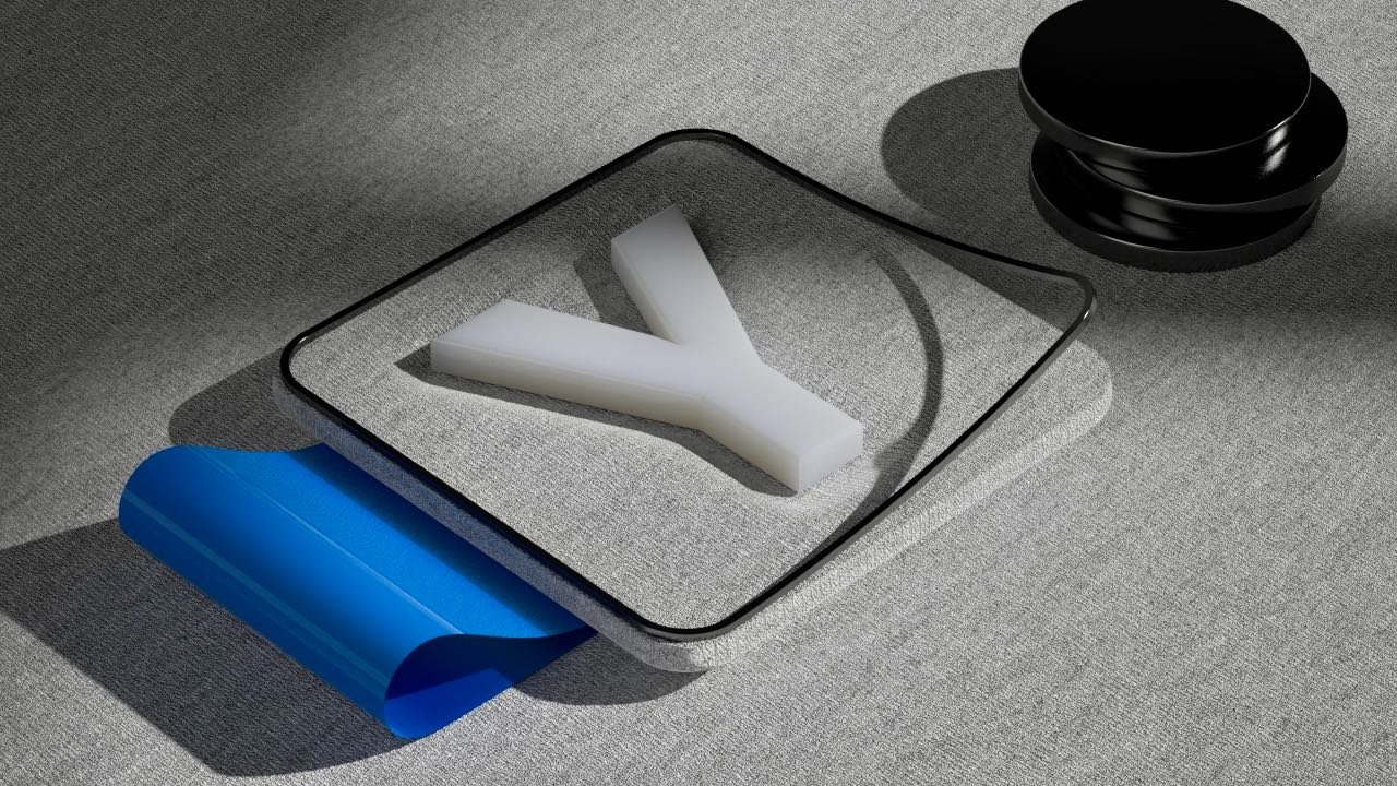
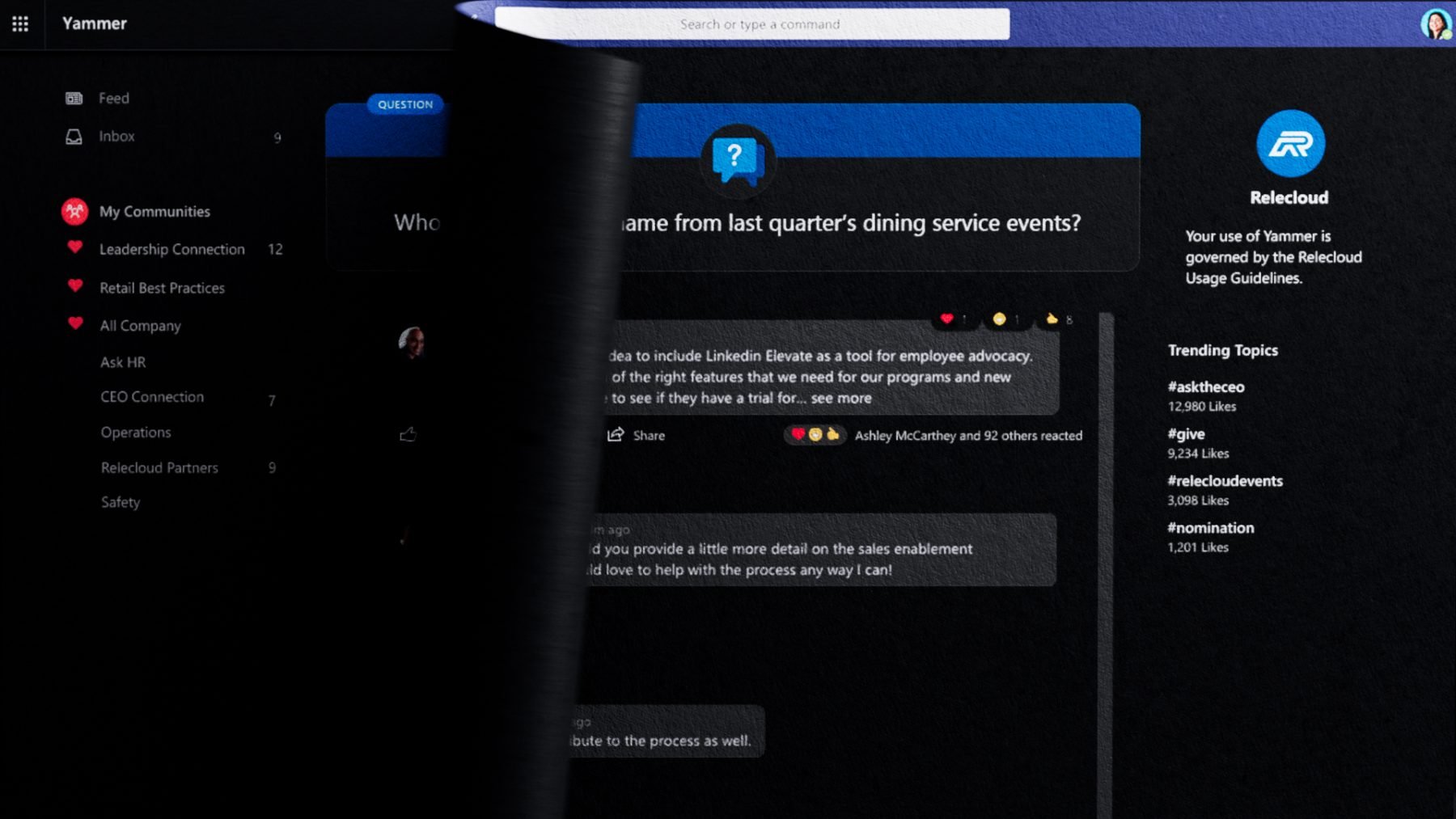
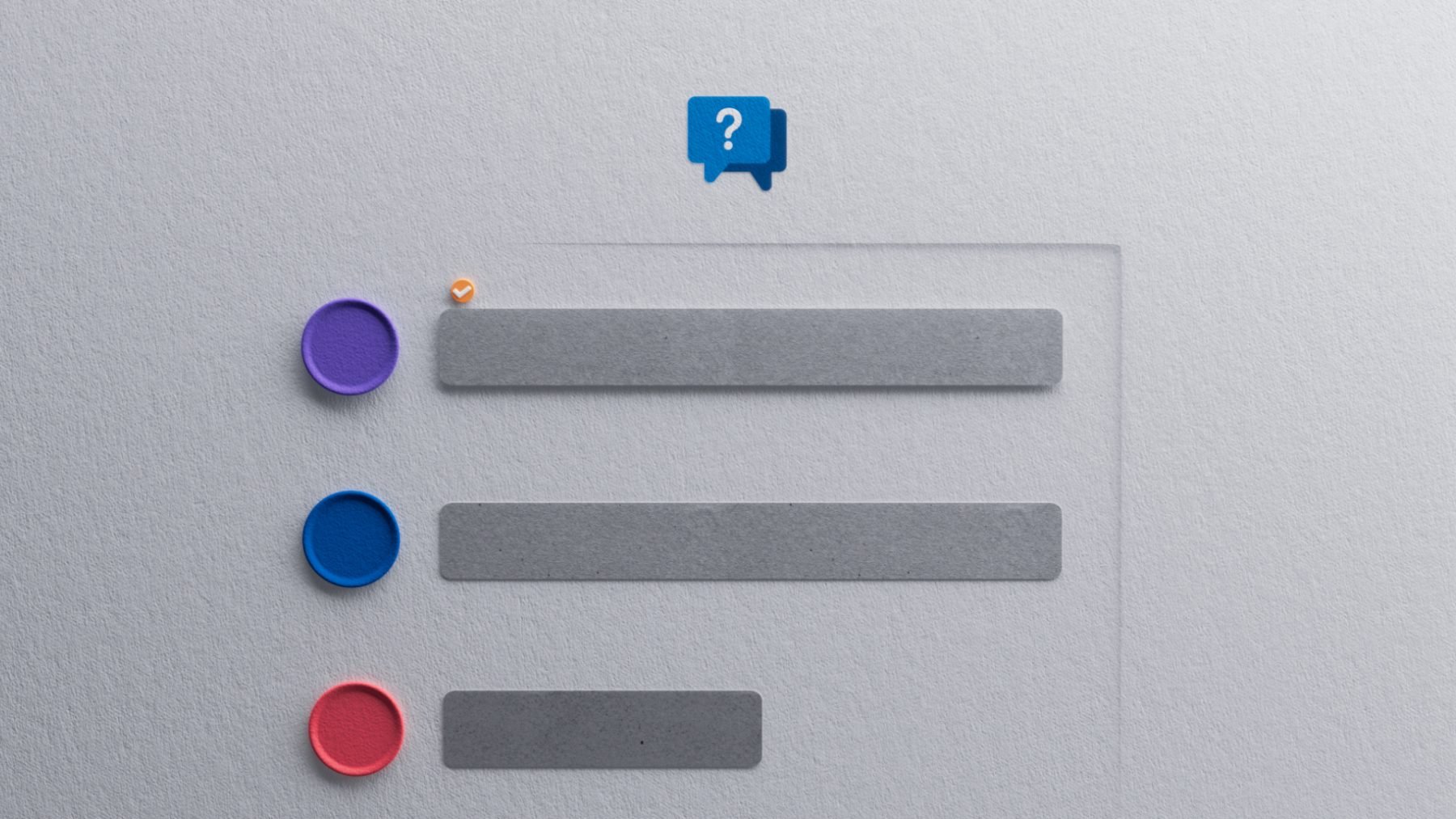
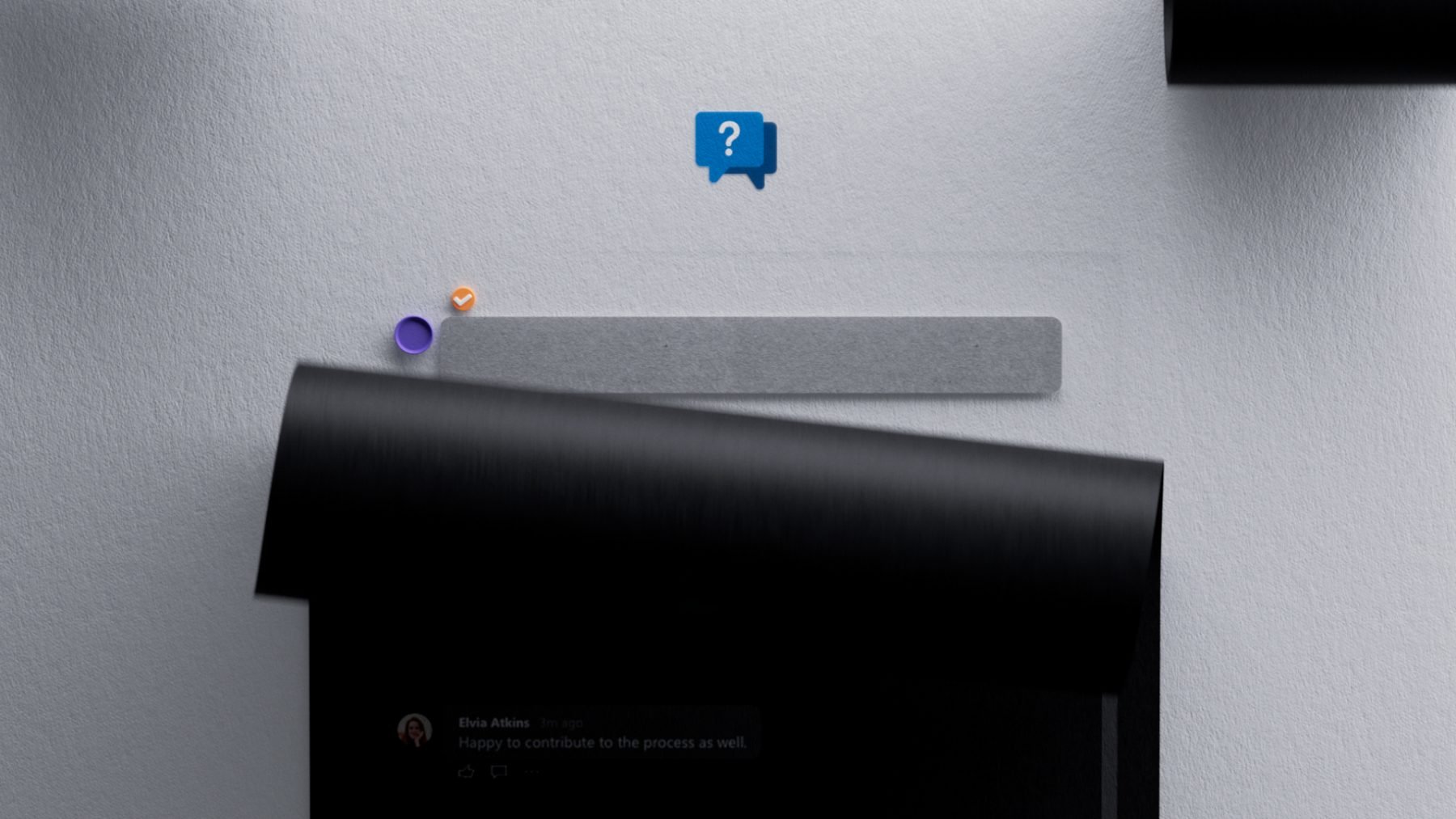
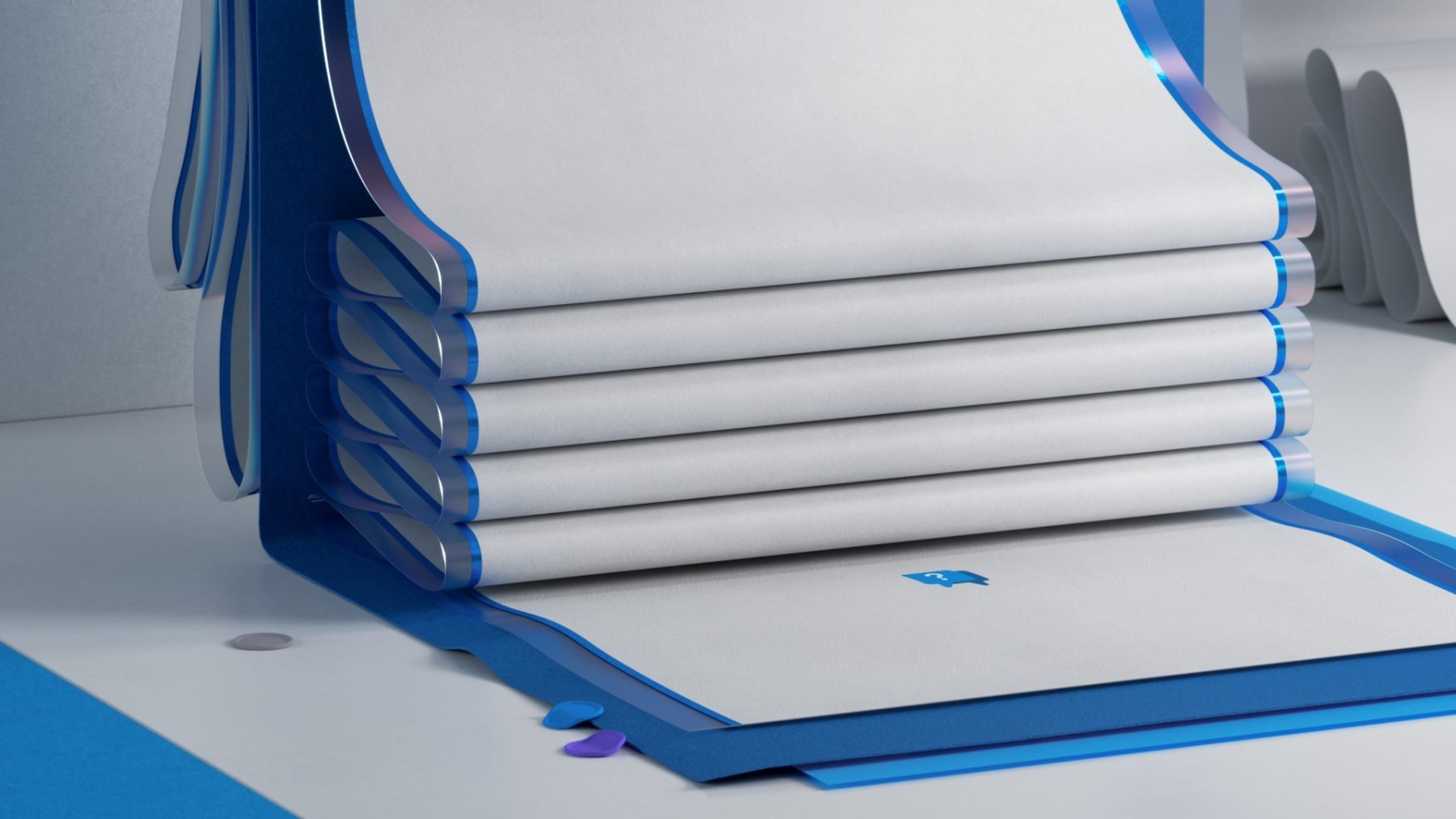
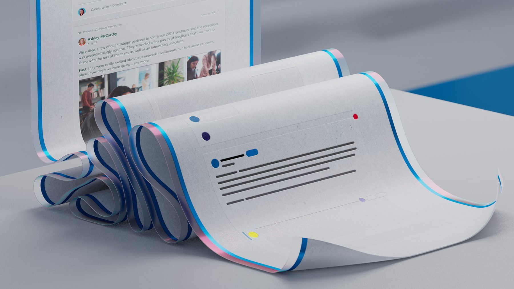
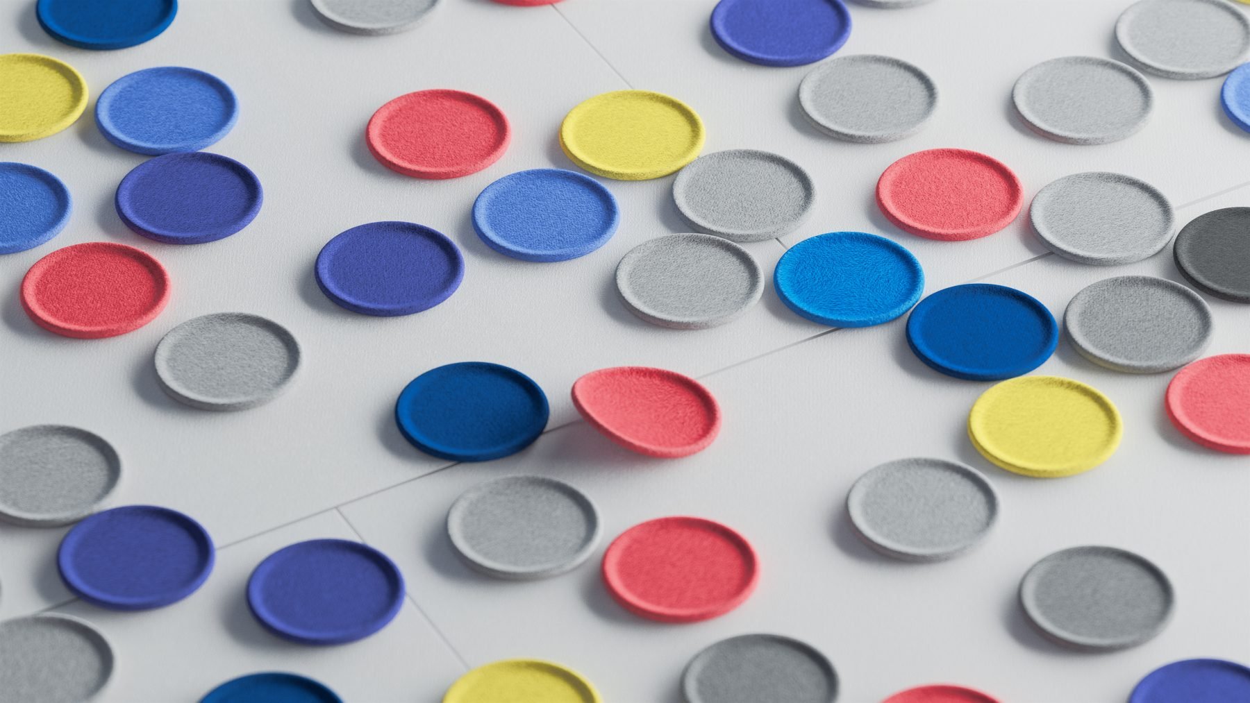
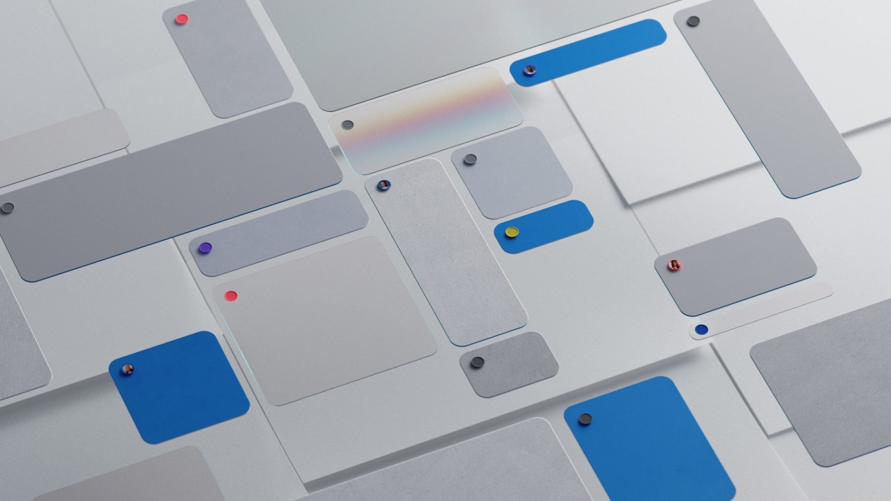
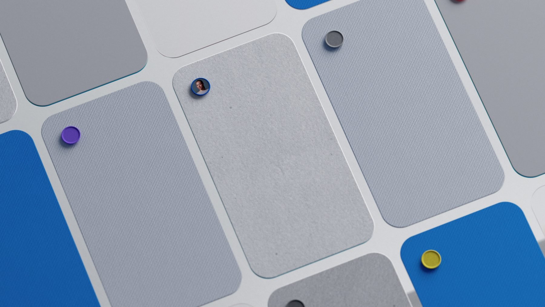
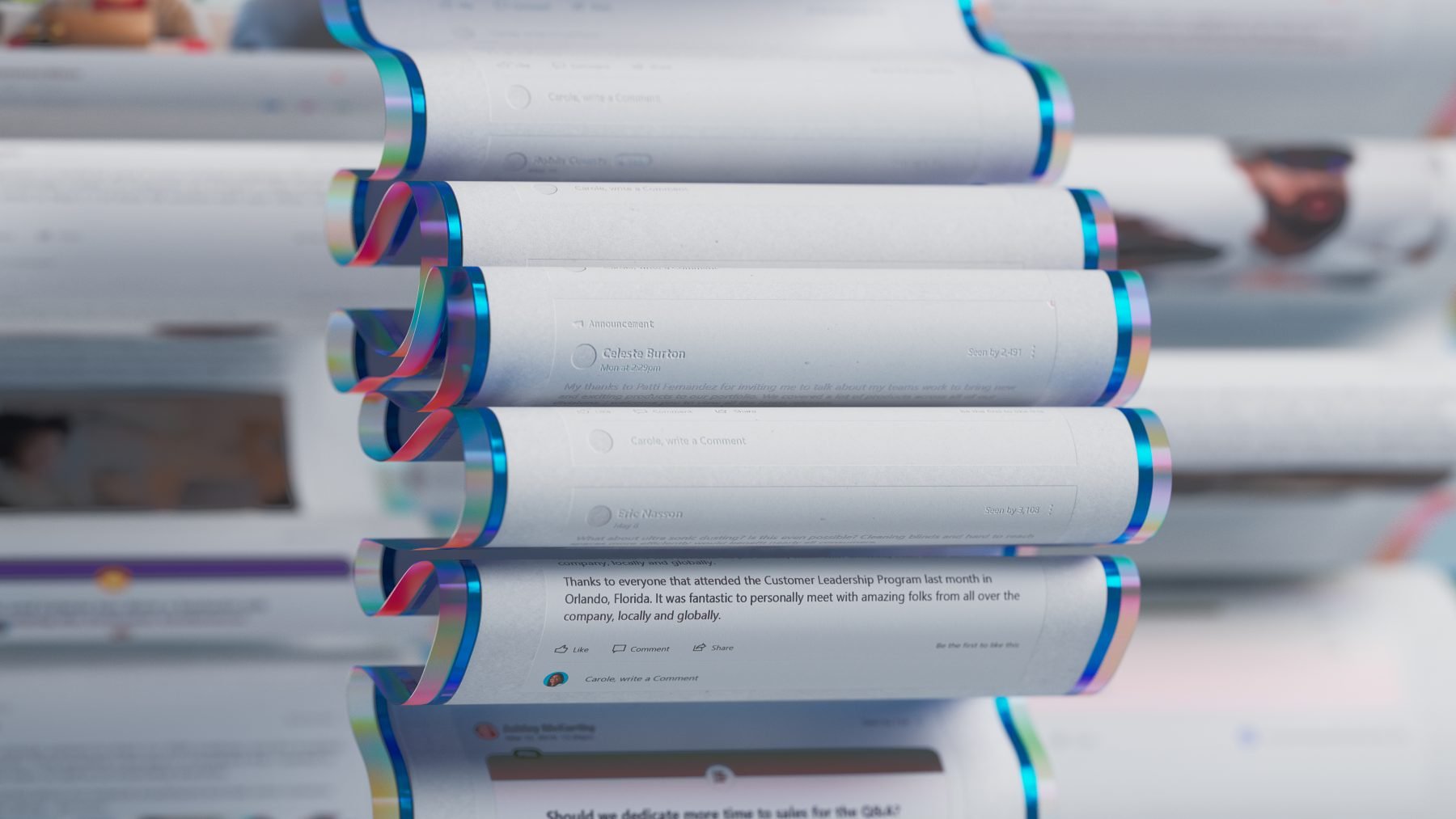
We explored various design metaphors that could effectively communicate mass communication and interactivity. We carefully crafted a library of unique fabrics, surfaces and environments to emphasize simplified UX and UI. This aided to visualize the flow and a representation of people conversing and experiencing Yammer, strengthening cross-cross-organizational connections and building knowledge.
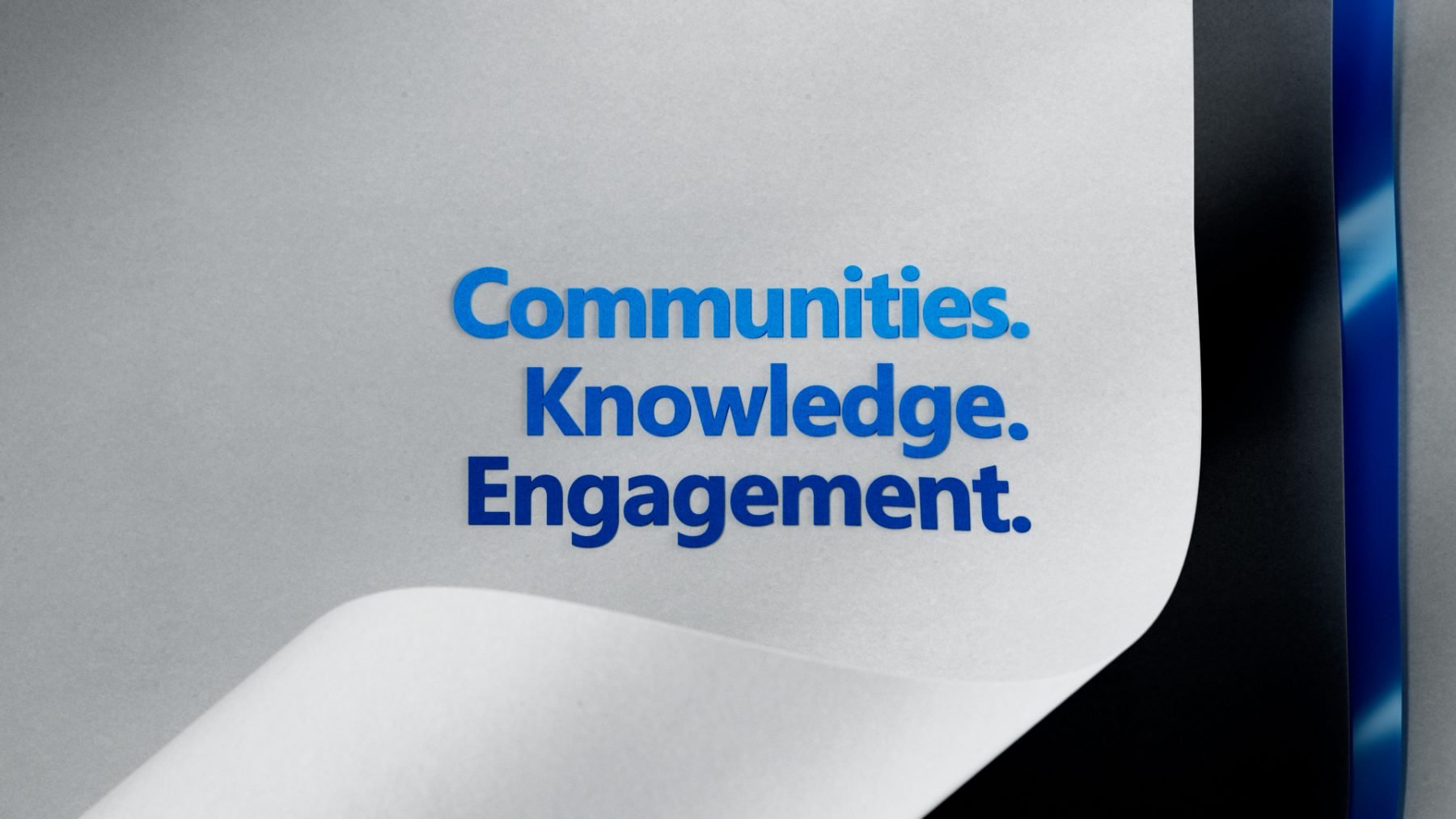
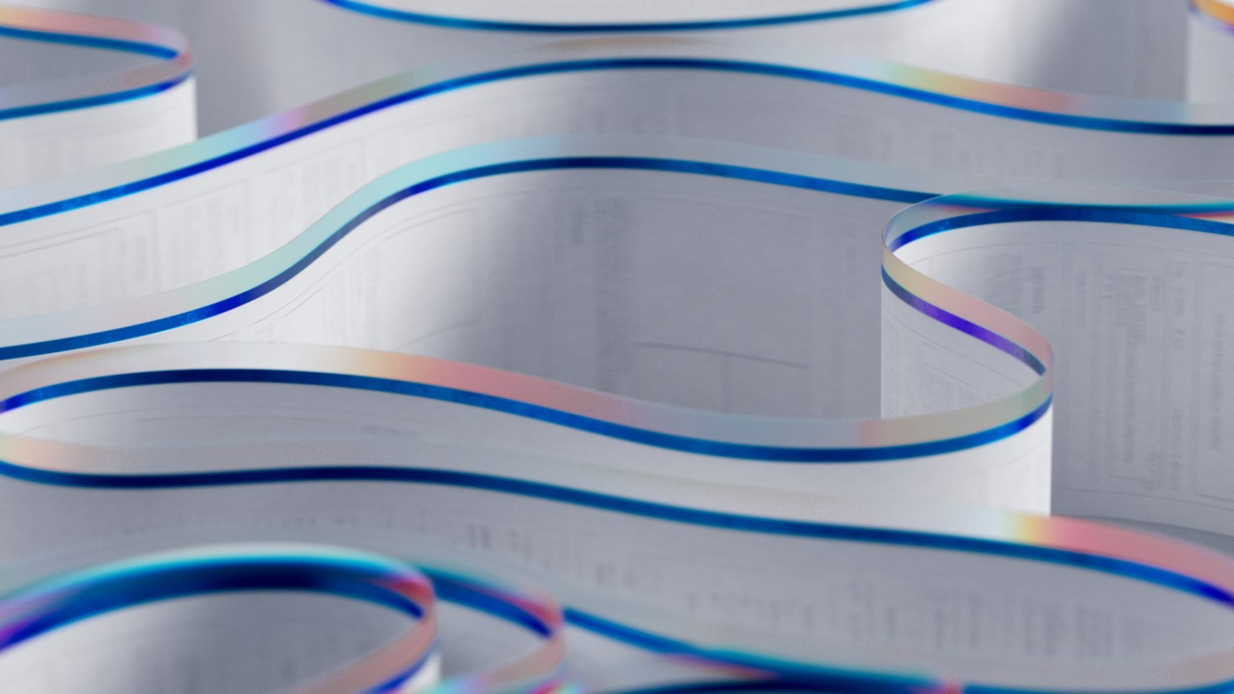
We chose to use paper, one of the oldest, most well-known mediums for communication, as one of our tactile textures to incorporate throughout the film. Drawing influence from elements like papyrus scrolls and card stock allowed us to visualize and emphasize diversity across different media. Integrating these tactile elements with future-oriented design thinking like translucent displays, allowed for a nice interplay between the modern and the traditional. Our current canvas is the hybrid between paper and translucent glass, and that is how we tell the Yammer UI story.
The sound design was brought to life by our long-term collaborators at Zelig sound.
Other Credits here: Tendril
PROCESS
Client:
Production:
MY ROLE:
MICROSOFT
TENDRIL
LIGHTING, RENDER
